- Contact
- Legal notices
- ©2026

A brief history
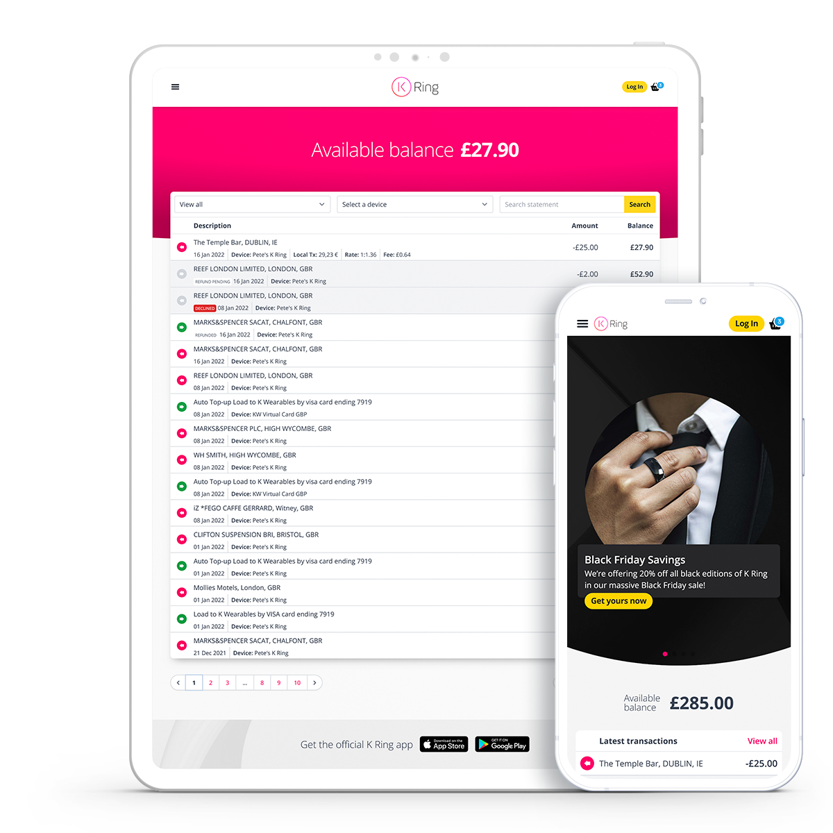
In Autumn 2015, the site, formerly known as kerv.com, debuted as a simple static support site for the Kickstarter crowdfunding campaign. I created the static templates using the Foundation v5 framework, which claimed to be at the cutting edge of responsive development at the time.
Foundation is the most advanced, responsive front-end framework in the world. The framework is mobile friendly and ready for you to customize it any way you want to use it.
Foundation was kept as the project’s framework until v6.3.3, when it was determined that our extensive modifications had significantly bloated the source html templates. Overwriting default foundation behaviour took up an increasing portion of the production CSS.
The redesigned site would need to provide significant optimisation gains while also incorporating any recent improvements that had been applied to the official MyKRing app. As the site became more complex, it would also need to address the increasing specificity of CSS declarations. Despite the fact that BEM naming conventions were used throughout the templates; some features had become overly complex.
Spring refresh
Tailwind CSS and Alpine.js were chosen for their utility-first and minimal approaches, respectively. Both frameworks rely on inline markup, which can result in a cluttered source view, but the advantages are direct control and significantly reduced asset load. Tailwind dramatically reduces CSS bloat when building for production by scanning the markup and removing unused CSS. The minified CSS bundle has been reduced from 624kb (multiple files) to 168KB. Alpine uses directives within the markup to define HTML chunks as components, eliminating the need for referencing.
Example markup:
<div
    class="credit  opacity-0 transition-opacity duration-300 group-hover:opacity-100"
    x-data="credit"
>
    <button
        class="credit__icon "
        aria-label="toggle credit"
        @click="toggle"
        :aria-expanded="open ? 'true' : 'false'"
        aria-expanded="false"
    >
        <i class="fa-regular fa-image" aria-hidden="true"></i>
        <span class="sr-only">Show image credit</span>
    </button>
    <div class="credit__text" x-show="open">Credit: K Wearables</div>
</div>
I saw this project as an opportunity to use the static site generator Eleventy to manage the generation of the Front-End templates. The initial setup time is obviously longer when layouts, partials, and components are used, but for a complicated site like this, it makes any future features simple to apply and preview. Before any development is scheduled, new features can quickly be reviewed in a static site preview.
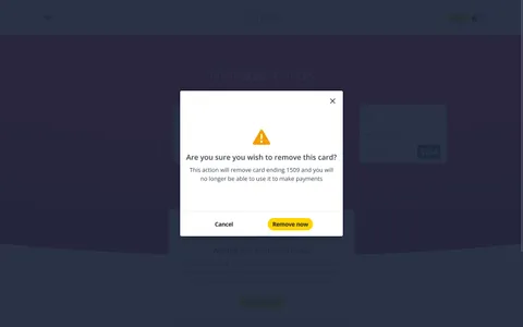
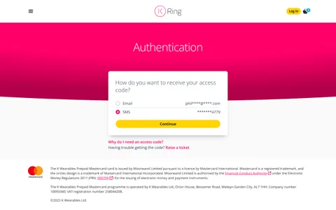
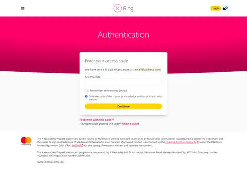
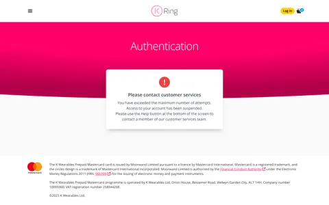
Any screen can be directly accessed by developers, partner clients, and stakeholders. This was especially useful for translators, who often need more context to create concise translations. Some screens can only be accessed under certain conditions, which can be difficult and sometimes impossible for third parties to recreate.
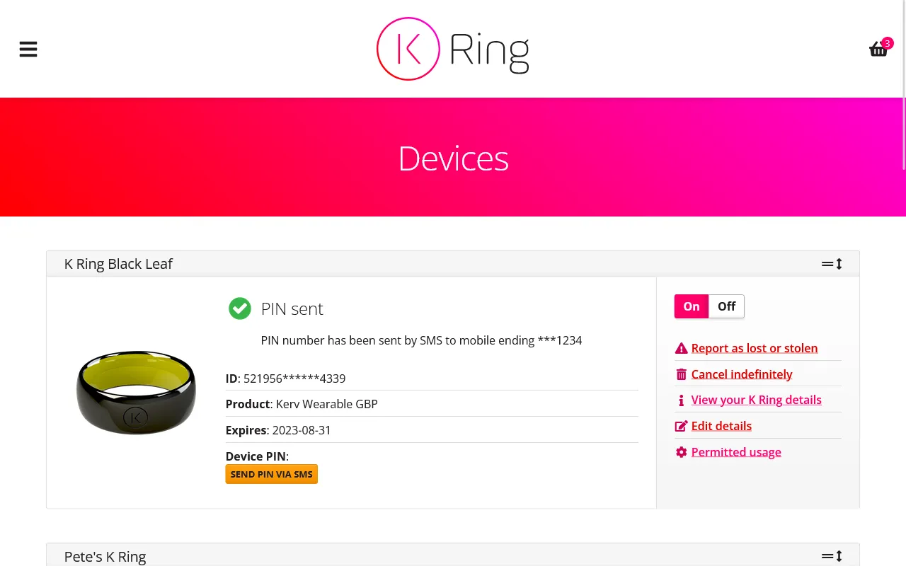
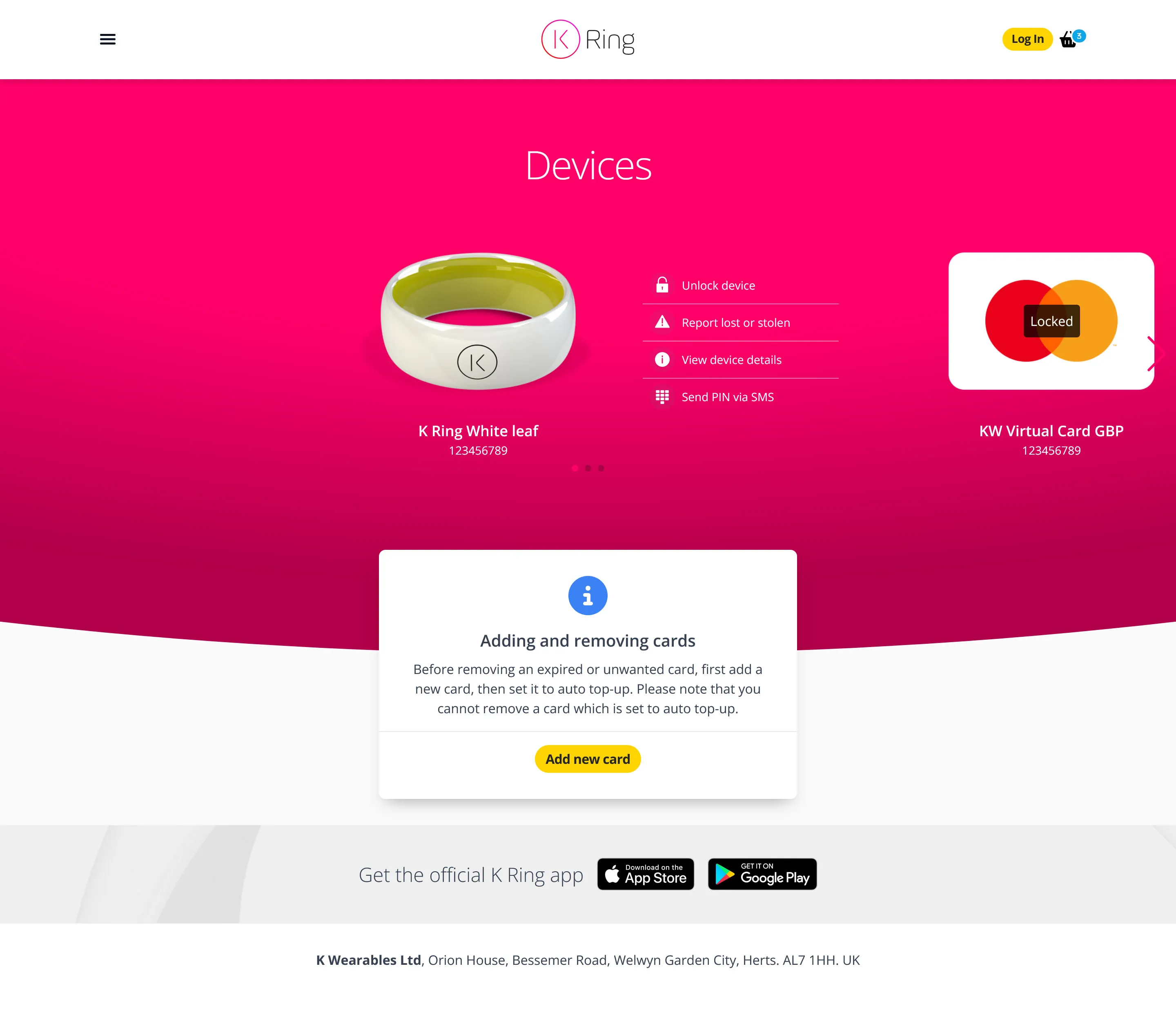
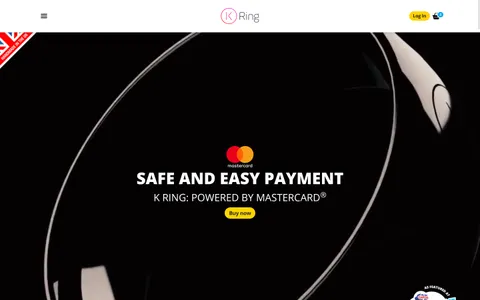
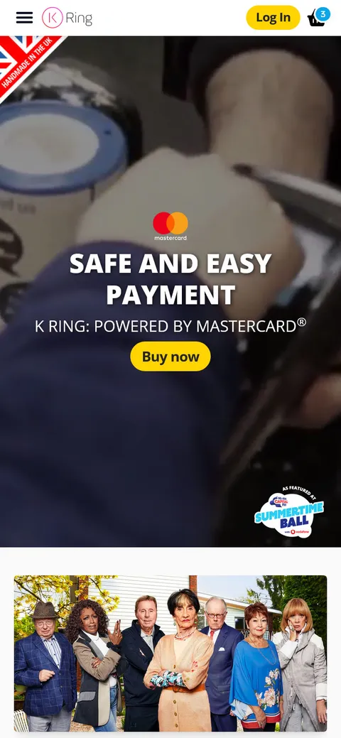
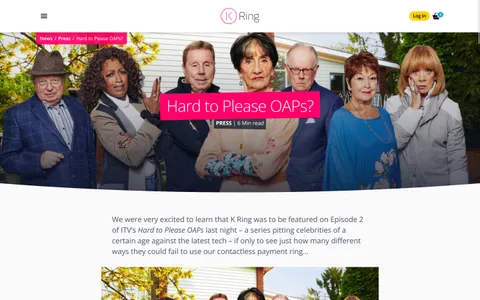
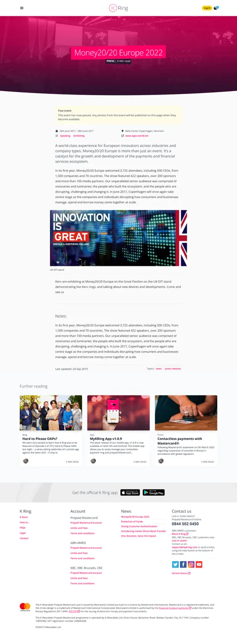
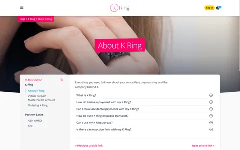
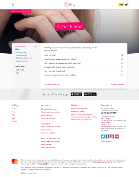
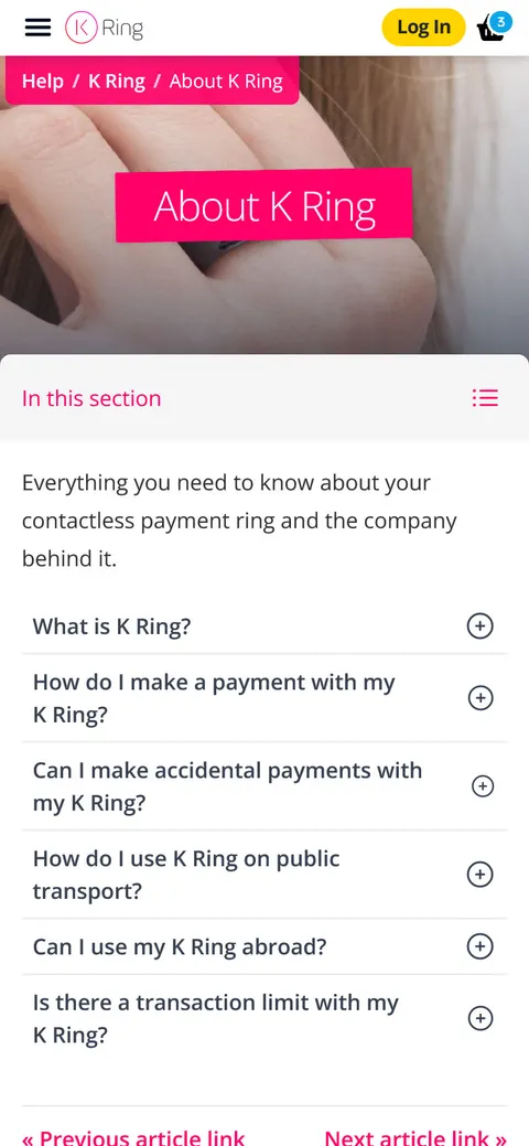
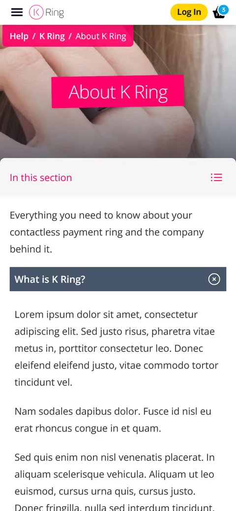
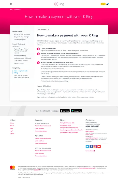
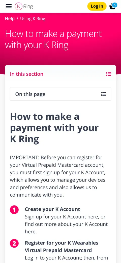
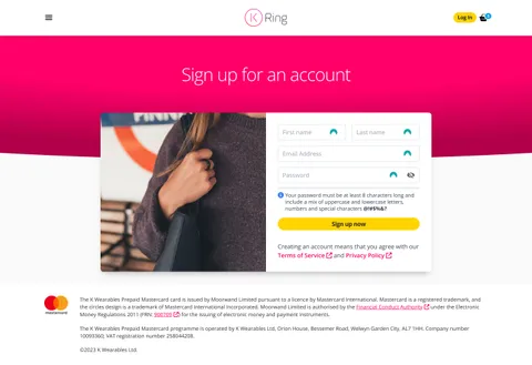
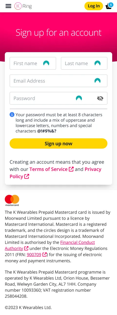
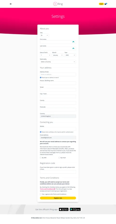
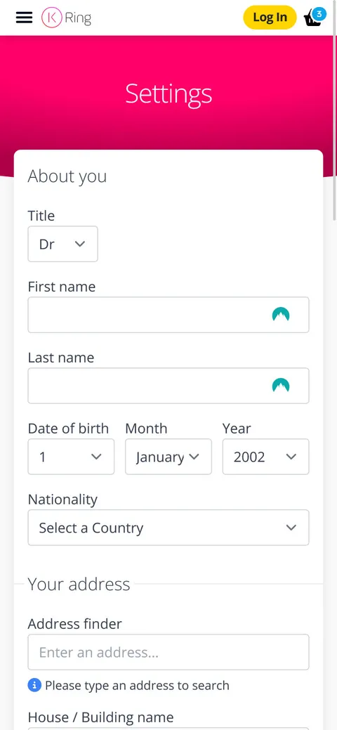
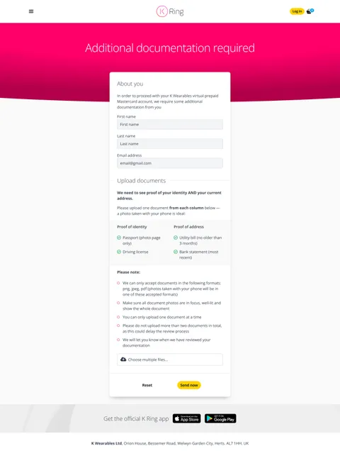
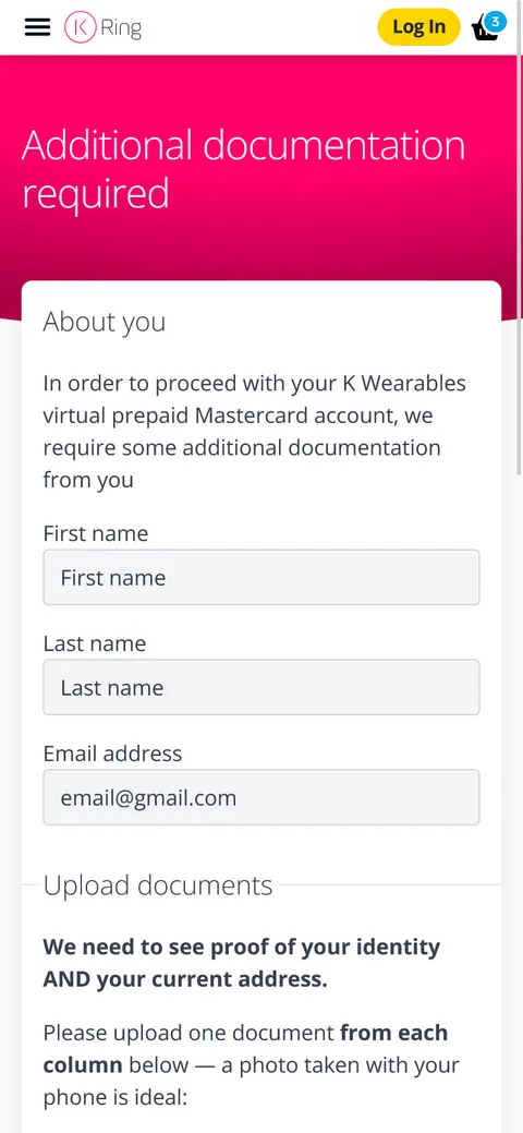
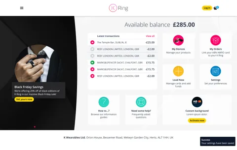
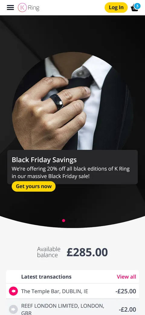
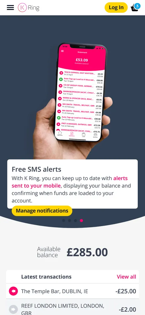
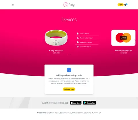
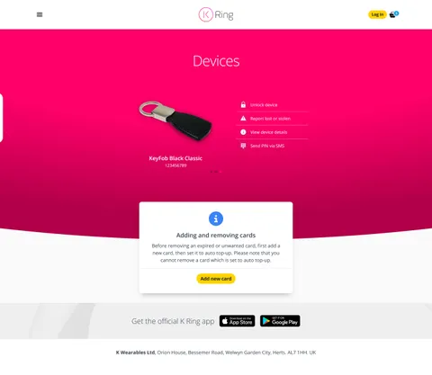
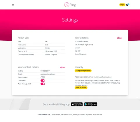
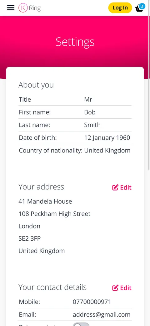
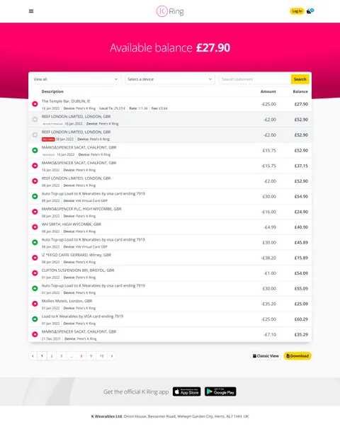
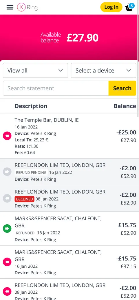
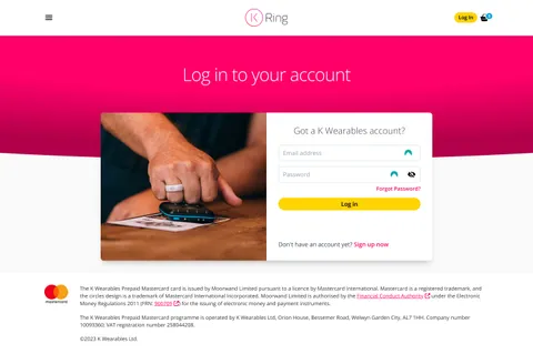
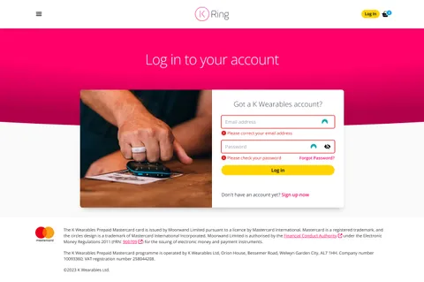
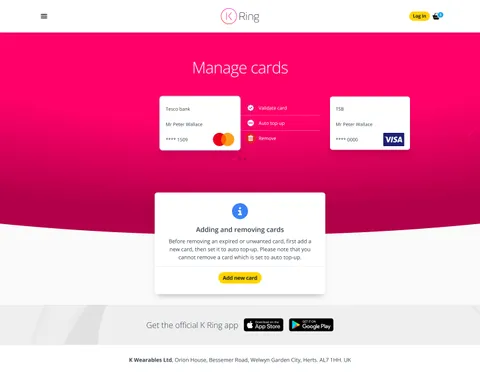
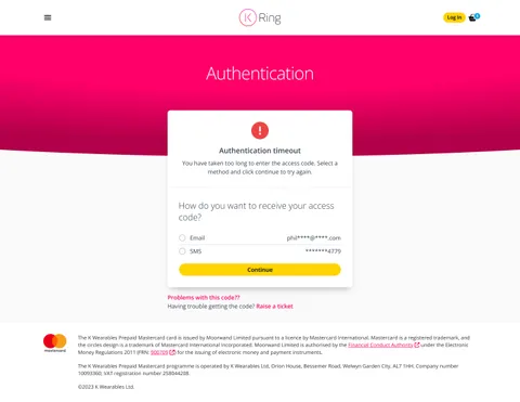
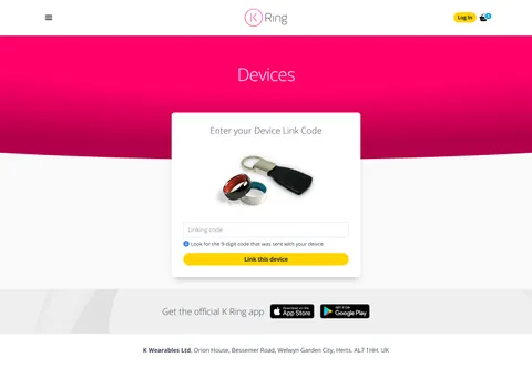
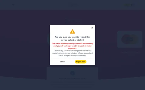
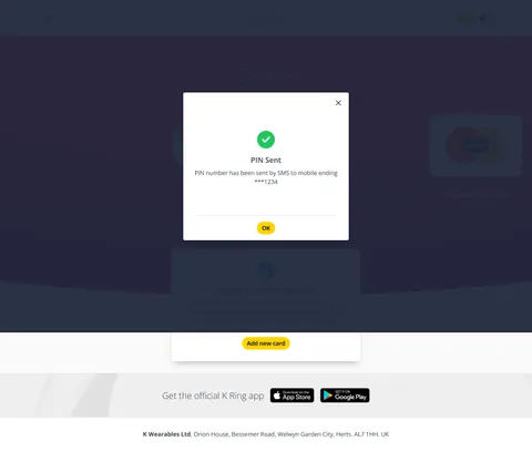
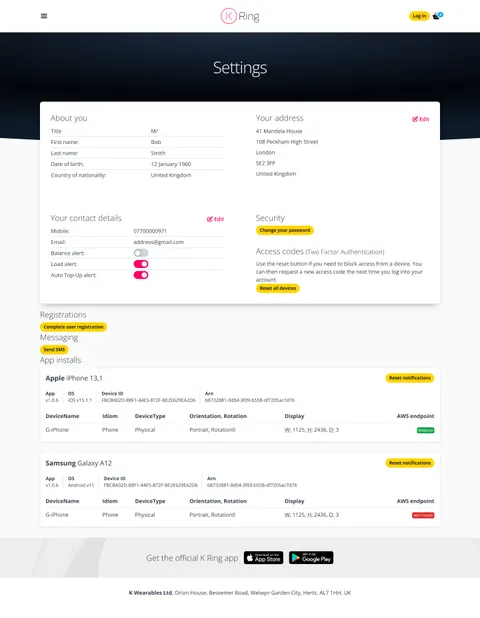
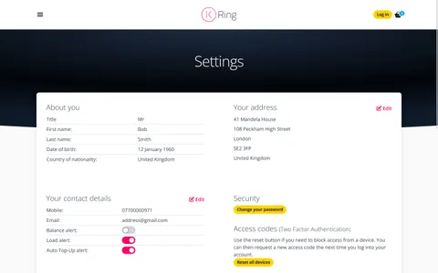
An example of before (left) and after (right) the spring refresh. The brief was to reduce the visual gap between app and website. Tap each image to view in detail
My responsibilities
- The designs and static templates were hosted in a secure listing to keep stakeholders informed throughout the development process. Project management
- I built all of the Front-End HTML templates from scratch using an internal wireframe ppt document. These were then given to a team of back-end developers, along with detailed annotations, listing indexes, and support documentation.
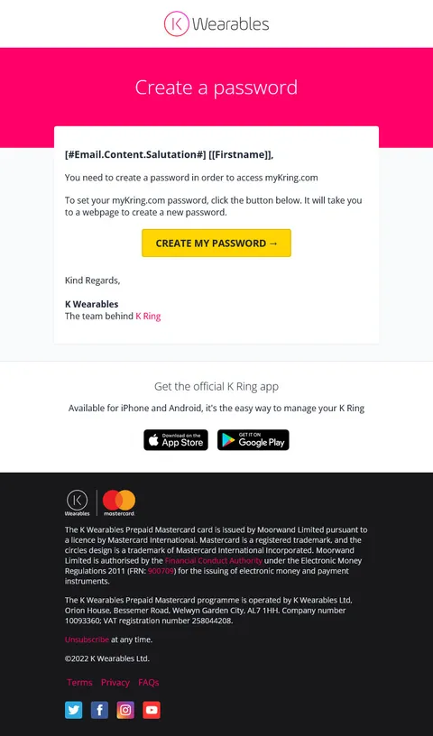
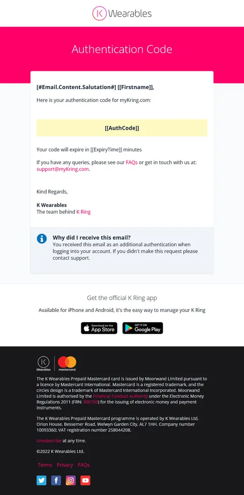
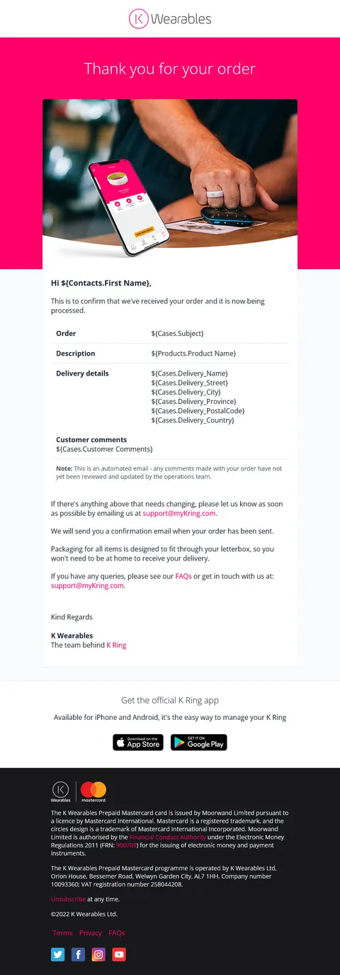
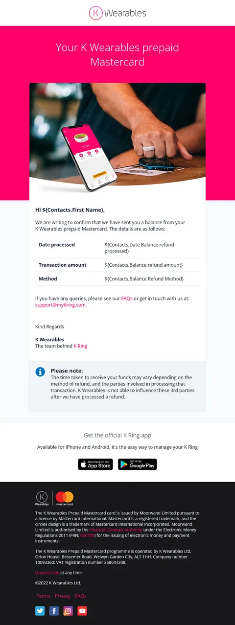
- I created a complete set of email HTML templates that would work with Umbraco’s dictionary to handle the multilanguage requirements.
- I assisted in the configuration of the content management system (Umbraco) and was in charge of the initial populating of all launch content. collaboration
Learning points
The redesign process provided an excellent opportunity for me to become acquainted with some new frameworks. During this period of intense self-development, I gained experience with Tailwind CSS, Alpine JS, Webpack, and Eleventy. Despite the steep (and at times daunting!) learning curve, I’m now ready to tackle the next project with confidence.
Scope for improvement
The myKRing app accomodates “dark mode” functionality and it would be nice to offer that functionality on the website. Tailwind CSS includes a dark: variant that can be switched manually via javascript and localstorage or using the system preferences.
Final thoughts
The redesign has improved the relationship between the app and the website. The design revisions should provide a more consistent user experience across all access points. The Devices and Load sections received the most attention during app development, so it was critical to incorporate those changes back into the site.
Unfortunately, the reworked templates remain on hold at the time of writing, and have not been scheduled for development.
