- Contact
- Legal notices
- ©2026


At launch, K Ring users could only manage their rings online. Although a responsive framework was used during the development of the website, customers still anticipated a separate app and all the benefits it provides.
With no prior app development experience, the learning curve was steep. Xamarin.Forms was chosen because it offers a cross-platform framework with a single code base. The main website already used the .NET developer platform, so extending that to the app made sense.
Although an initial wireframe document was provided, it was essentially an imitation of the mykring.com responsive pages. Rather than simply replicating what we had, we wanted to improve the user experience wherever possible.
My responsibilities
- Re-design the supplied
.pptwireframes to make use of the xaml display collections in Xamarin.Forms. - I created the static layouts directly in Visual Studio - using temporary static pages to speed up development. A developer would then duplicate these pages into the appropriate locations and assign the required dynamic properties. Subversion (SVN) was used to control the development versioning.
- I oversaw the image library, ensuring that all assets were available in the appropriate resolutions for iOS and Android devices. This was a combination of converting existing assets and creating new artwork for the app.
- I assisted in the configuration of the content management system (Umbraco) and was in charge of the initial populating of all app-specific launch content. collaboration
- I helped with the testing, creating user test scripts and reporting any bugs as issues within Azure DevOps
- After launch, I began a review process of the product website to see what updates could be applied to provide a consistent user experience across the app and site.
So glad there’s finally an app for K Ring!
Good user experience: same interface style you’re used to from the website, but not just a web shell. Easy to navigate and use. Notifications through the app are a plus!
James, 26 November 2021, Play store
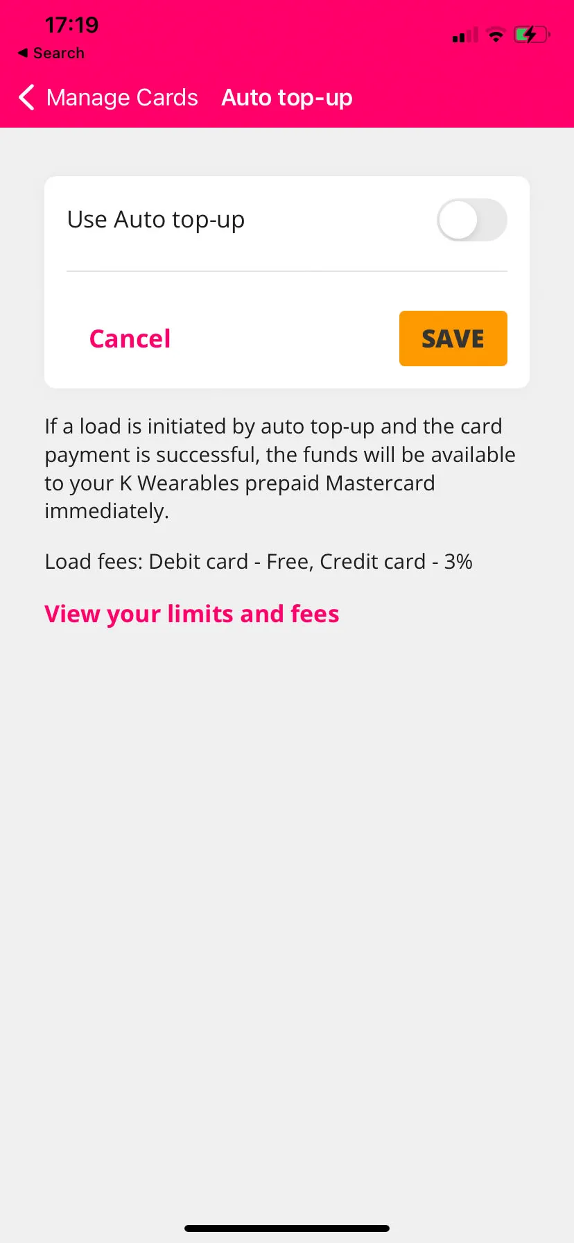
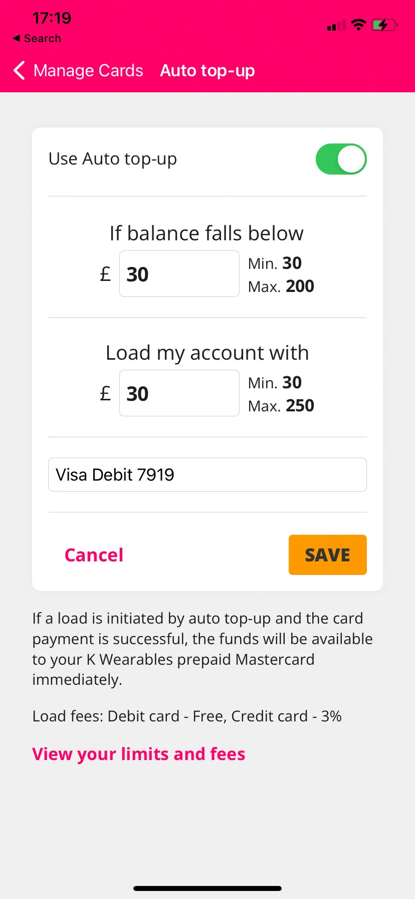
The ‘Auto top-up’ feature is a good example of a user path that was enhanced during the app development process. It was previously a load method but is now only available as an action for validated cards (a prerequisite of the auto top-up service) in the Manage Cards section. Each card has its own set of available actions, which update as the user swipes through their collection. Cards that have not been validated will show a button to begin the validation process. This is followed by a ‘Complete validation’ state and, finally, a ‘Validated’ indicator. At this point the ‘Auto top-up’ button becomes active. Cards used for auto top-up cannot be removed until auto top-up has been turned off. As a result, the ‘Remove’ option is set to disabled. By controlling visibility, we can remove redundant options, resulting in a smoother experience.
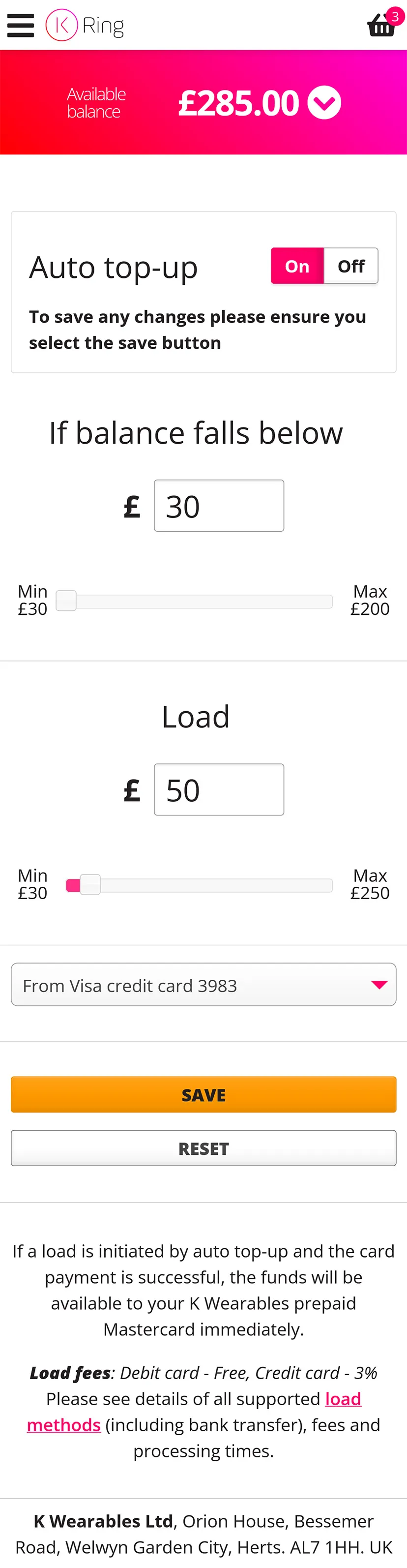
Unnecessary elements from the online responsive version (left) were stripped out to streamline the app layout (middle and right)
The Auto top-up form was also streamlined and only appears when ‘Use Auto top-up’ is toggled to on. The input sliders were removed as they became too fiddley within the mobile viewport. The minimum and maximum values are now displayed alongside the input field.
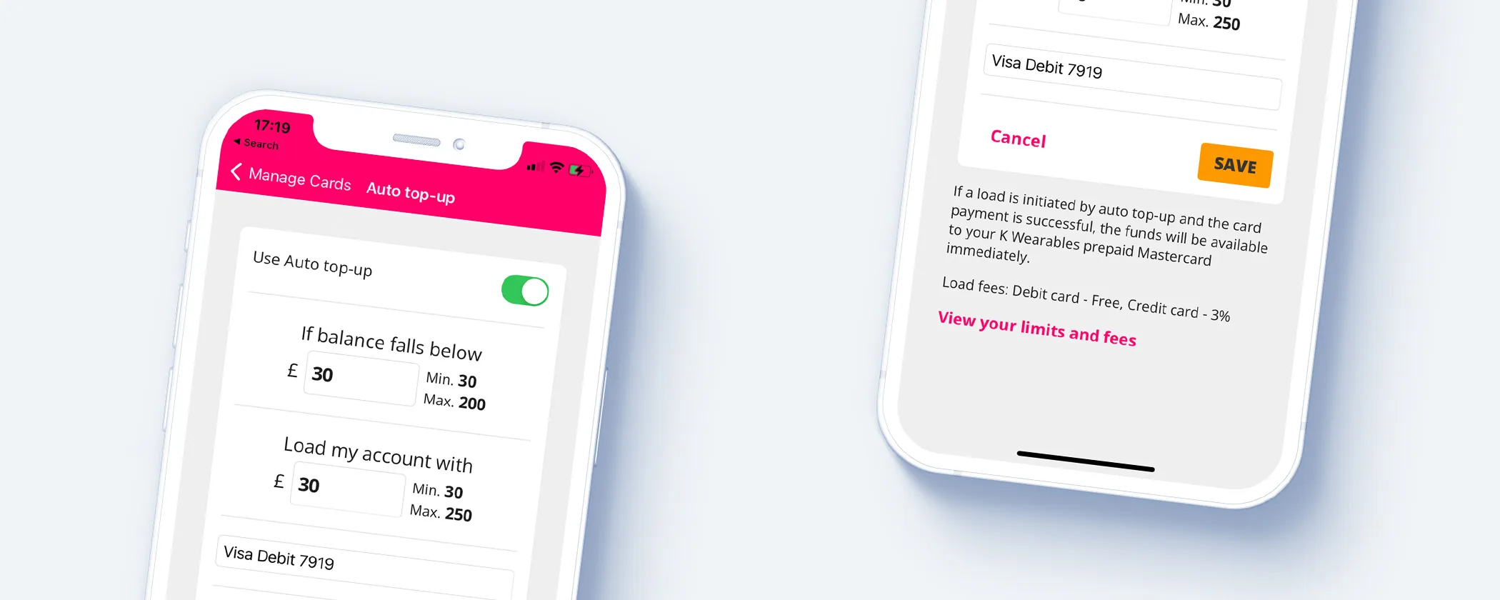
Users can manage Auto top-up functionality using a simple toggle.
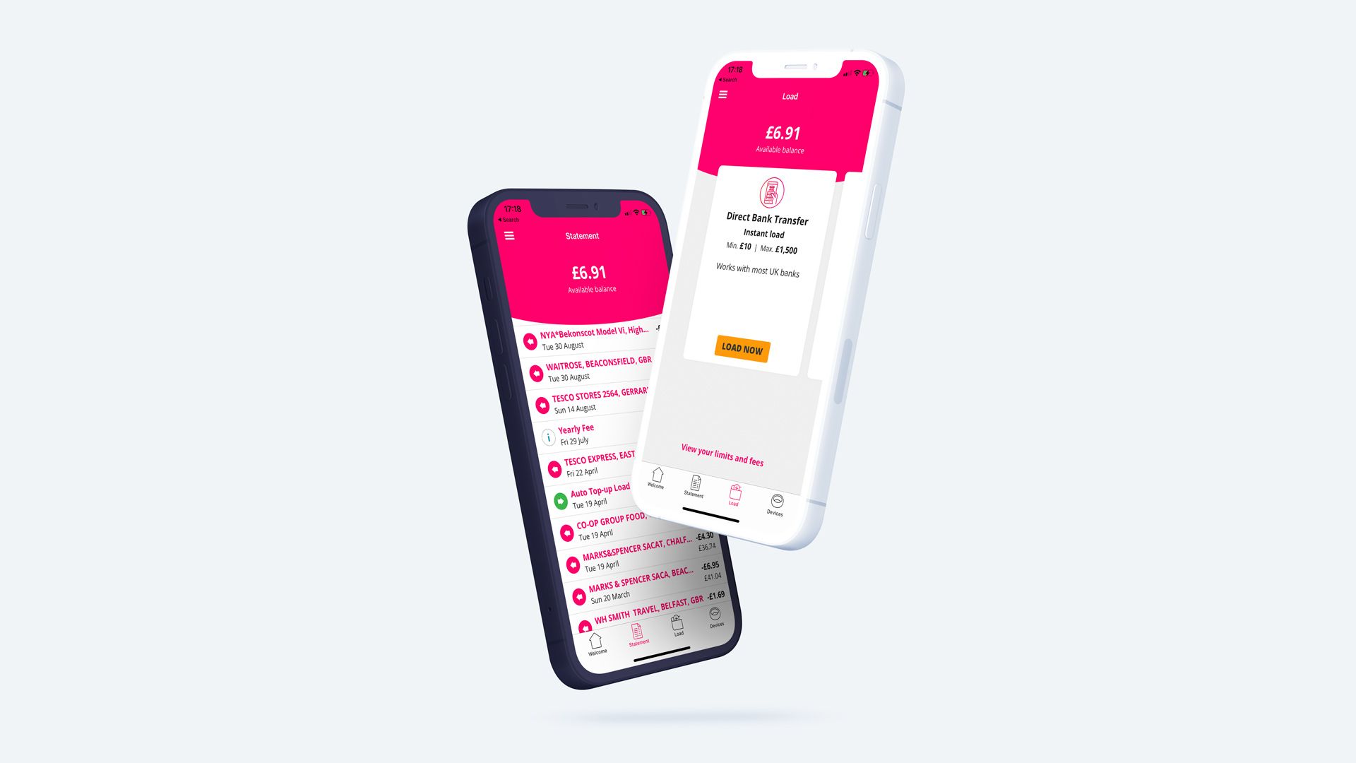
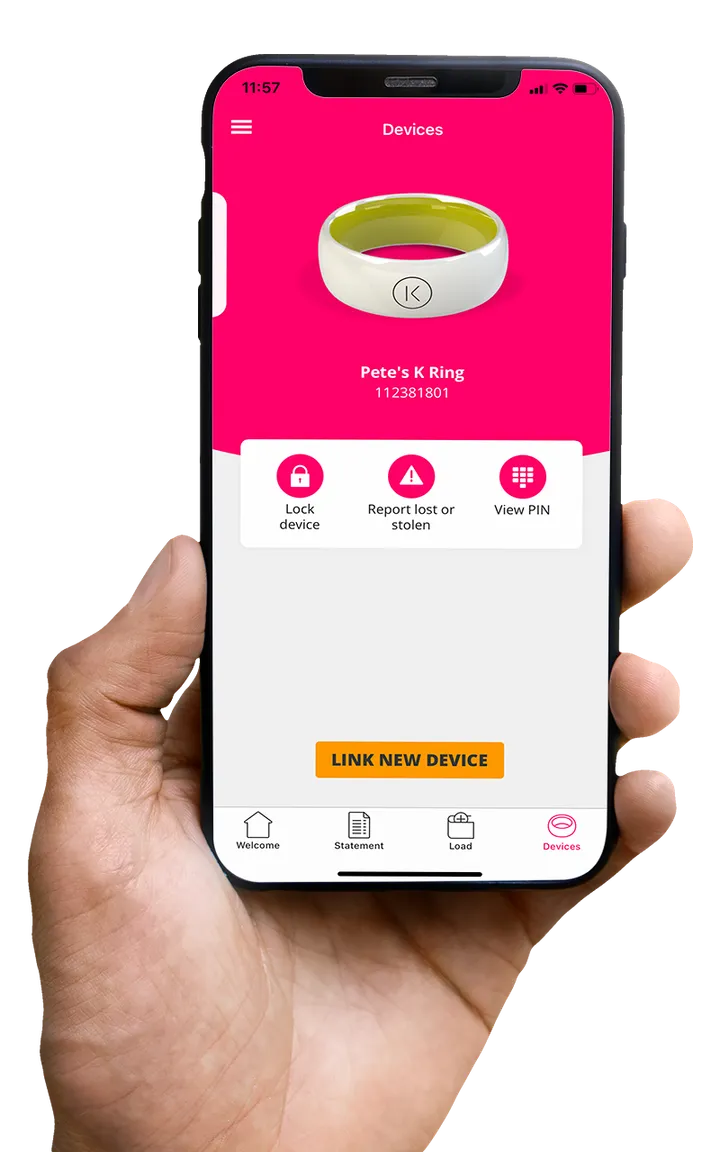
App screens


Swipe
Scroll


Ratings and Reviews
4.6 out of 5 (Sept ’22)